Showing posts with label character design. Show all posts

Sunday, 12 February 2012

Design considerations: Scarecrow

I found that I had a far more difficult time drawing the scarecrow than the crow; I'm not entirely sure why. I think it's mostly due to the fact that I don't 'know' him very well — I've not really spent enough time with him. It's one thing to know a character's personality but another matter entirely to truly understand what makes them tick. But, again, this is mostly shape experimentation — once I've got a feel for the shape of scarecrows I can begin trying to get inside his head and really work on bringing some life into him.

Just to clarify, obviously what I'm putting here is simply my own interpretation of the characters — I hope I don't come across as if I've totally dominated the design! I just thought it might be helpful to put these up and show how I approached the subject. :]


Again, I started just by looking very generally at some scarecrows. I really liked the one in the lower right corner; a great example of a simple but pretty refreshing take on the conventional scarecrow!


I toyed with the idea that maybe the scarecrow could look as if he was trying to be scary, perhaps by giving him long, thin and pointed fingers — perhaps they could even be made out of sticks?

Jazzy specified that the scarecrow should be tall and very thin to emphasize his clumsy nature — maybe we could give him big hands and feet to further suggest this? 

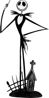
I was looking at some other tall, spindly characters as a point of reference —Jack Skellington in particular, as though he's a little different to what we're going for in terms of design his exaggeratedly thin limbs and a rather large, circular head are quite nice features for a scarecrow. I really liked how the eyes and mouth looked on Jack so I tried to incorporate something similar into some of the sketches.


I was mostly just experimenting with body language and more head designs here; I wondered how a naive and slightly nervous character might hold himself, I thought perhaps with his feet turned inwards, but he just ended up looking really timid and anxious. 

A stocky design for the crow might work quite nicely with a scrawny scarecrow — the combination of tall/thin and short/stocky characters is quite prevalent in a lot of children's animation. Many notable cartoon duos have massively contrasting body structures:

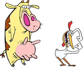


Radically different body structures in visual media where two or more main characters dominate the screen helps to create visual distinction and interest — strong silhouettes so that the characters remain recognisable in any given situation (at a distance, in the shadows, even in different costumes)

I thought this might be a nice idea to play around with and so experimented a little more with the idea of a short, fat crow:


I started trying to think more about character interaction at this stage — how the scarecrow might physically respond to the crow whenever it comes near him. Should it be outright terror, or is it more subtle? Is he merely uncomfortable around crows, or physically repulsed?

Was thinking about what sort of clothes he might wear and was slightly amused with the thought that, being a scarecrow, he just wore whatever leftover tat the owners had lying around — an outsized sweater, a lonely oven glove?

I'm going to focus more on actual scenarios and character interaction now, to try and really get to grips with the relationship and personalities of the two characters. Hopefully this will help me bring out more character in these drawings!

Design considerations: Crow

Well the pitch is over — let's not dwell on what did or didn't happen — I've been made producer as part of Group 7 with some most fabulous team mates, lead by our great director Jazzy. Our animation monkies executive animators are Sam (Bunce) and Jae (Hezhenyi). Very very pleased with this outcome and really excited to get started. If a bit nervous (what else is new?)

Jazzy's asked for us all to start sketching out some ideas in terms of character design and story progression, so that when time comes on Tuesday to begin scriptwriting we can cherry pick from everybody's work so that the final product is something that each of us feel we had a fair share of input on.

I've been scribbling both characters (the scarecrow and the crow), trying to come up with something interesting, and just figured I'd post up my progress (and the usual rambling reflection) so far.


The first stage in designing an interesting or strong character is, I feel, gaining an understanding of what it is that you're drawing. If your character is an anthropomorphic singing teapot, go and draw lots of teapots and start considering how you might anthropomorphise or physically characterise them! In this instance, the character's a crow, so I started on Google Images and started drawing a bunch of crows with varying success. Mostly none.

I had a great deal of difficulty in drawing the crows from reference. I can't simply sit down and copy what's in front of me — I find it very difficult to capture any sort of life that the original has if I don't understand why it's shaped like that or why it moves that way. As you can see from the drawings above I really wasn't into it — my crows looked more like seagulls!


So, for me, the next logical step was to take a look at some basic bird anatomy. I Googled a bunch of skeletons and a basic bird anatomy tutorial that explained the basic positions of limbs, construction of muscles etc. I don't feel there's a need to turn it into a biology lesson and learn the names of each underlying bone or muscle, but just knowing what's underneath the surface of what you're drawing — the construction and the basic mechanics — is amazingly helpful. 


As proof — look! My crows, I feel, improved noticeably almost instantly (except that one in the lower right corner — no idea what happened there). I'm certainly still no wildlife artist, but I feel that I understand where the legs were, the wings, why the back was that shape and why the head arcs like that. As a result the drawings came together much more easily. In cases where the subject is very dark in colour and you can't see a clear outline of the limbs, knowing that they're there and how they move allows you to make an informed estimation when drawing them. 

Enough self-centred bragging, on with the designs:


I now started considering how a crow's design might be simplified or caricatured. They have much larger beaks and very beady little eyes, so it made sense to try and exaggerate those features as part of the design. Jazzy said that the scarecrow should be tall and thin, so I thought it would be quite nice to have the crow short and stocky with a lot of rounded edges to create a bit of contrast. 


Still toying around with the short/round crow idea at this stage. I was playing around with constructing the body from different shapes to see how that would effect the silhouette and implied personality of the character. I think I was struggling a bit at this point — I find it tricky to portray the personality of a character without context. Static sketches like these always tend to be a bit lifeless and dull, but at this point I'm just trying to get a feel for how different shapes and bodies come across.


The other specification/suggestion Jazzy gave us for this crow is that she wanted it to be very subtly girlish, so that there was a kind of flirtatious implication between the two characters. Of course the first thought is always to just add eyelashes to it, but that tends to feel a bit shallow and too obvious. I messed around with the idea of adding rosy cheeks to it instead, which I thought might work quite nicely with the dark feathers?


More toying with body types. I'm really liking the idea of such a squat body with almost no limbs — I think it creates quite a nice silhouette and gives a lot of distinction to the character. 


I'm not terribly happy with the drawings I've done so far; they feel quite stiff and just generally lacking somewhere. I think that a lot of it is to do with context; as I said, I find it quite tricky to portray the character without it — I suppose these could just be seen as exercises to get going, to get a feel for shapes. I think the real character will start coming through and developing itself once we start building scenarios. 

Tuesday, 17 January 2012

Sketchbook: hyenas, cats and old people

I've been wanting to keep myself busy over the break and had hoped to be able to get a head start on the next project. I've been drawing somewhat irregularly — my aim is to make a habit of it. I'm building up slowly — trying to do at least one drawing (or page of drawings) per day, which of course in the long run is nowhere near enough, but I want to get to the stage where it becomes second nature, where I don't even have to think about pulling my sketchbook out.

I had intended to start generating ideas for the next project already, before I learned that we would probably be given a list of words or themes to work from. Still, it's probably good practice to keep the ideas ticking over.

That being said, here are some doofy pages from my sketchbook from the past few days:


Nothing really behind these... just some doodles of hyenas. Top page was an actual exercise in observation, on the bottom is a page of doodles done whilst trying to sleep!

One of the books I got from the library gave some great suggestions on generating ideas; one was to take classic scenarios or stories and reverse character roles or insert new ones. I was just kind of messing around and turned Snow White into a disgruntled housewife who has to 'rescue' (or wake up) her oafish, sleeping husband.


I didn't really take it much beyond imagining some scenarios in my head before I got distracted and started drawing cats instead.


I looked at how some other artists and animators have simplified cats for use in comic strips or animation, to better understand how the relatively complex physiology can be broken down.


Understanding how something is built is crucial before you can start breaking it down and making it move, so I tried to get to grips with the basic anatomy of cats. They have really weird legs! 


I found a great little handout online discussing the anatomy of a cat for use in animation which I found really helpful, so I did some simplified drawings based on some of the examples there.


And then some more attempts to understand how the hell their hind legs work.

I don't really know if this was headed in the right direction but it's gotten me drawing again, which is always valuable practice. I think I'm rushing myself to try and get all the stuff in my head down on paper. I need to stop that, stop the panicking and just focus on a few little things at a time.

Andy suggested that I work on keeping the energy and quality of rough drawings through to the cleaned and refined version, which is something that I'd notably struggled with in the last few projects. I'm thinking of doing some more comic strips for general drawing/ideas/storytelling practice, so it might be good to try and combine the two. The last set of comics I did suffered a lot from the 'stiff artwork' problem (and just generally looking bad) so I need to get used to being less precious and working more loosely.